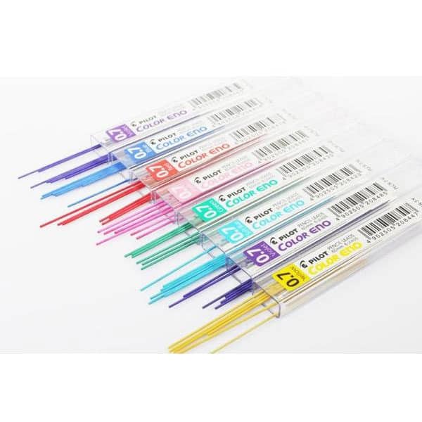
- 1. My Favorite Pens for Color Sketching
- 2. How I Choose My Sketching Colors
- TIP: Take Inspiration from Basketball Teams' Logos
- 3. Using Color in Action: A Quick Sketch Demo
- 5. Take Notes, Make Your Palette Your Own
- 6. Don’t Be Afraid to Experiment Like in a "Mad Scientist's Lab"!
- 7. Final Thought: Keep It Simple, Keep It Playful
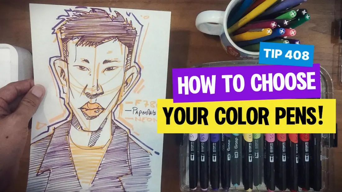
I was drawing my self-portrait today.
I know, I look quite serious in it. (See below) Hehe.
I realized something simple but powerful about using a 3 color combo to my sketches that I want to share with you. It’s a quick art tip that can make your design sketching experience more fun and manageable, especially if you’re just starting.
It’s super easy, and I show you how to select your colors to make your drawings vibrant!
I invite you to take a small mirror to your desk and draw your own color portrait too! (Or ask a friend or a family member to pose for you! : ) )
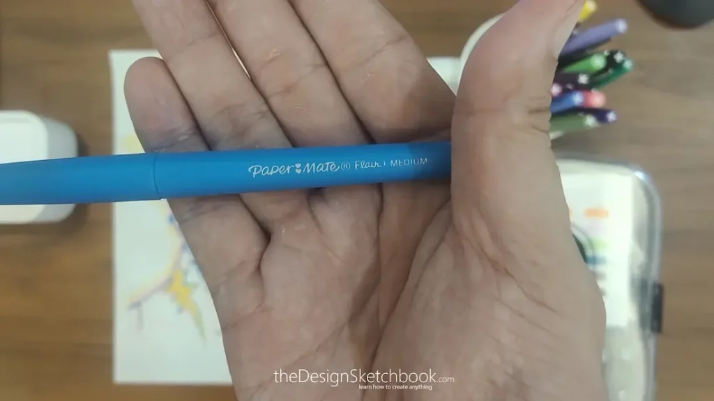
1. My Favorite Pens for Color Sketching
I use two main types of pens:
- Paper Mate Flair Medium pens
- Dual Acrylic Brush pens.
The Paper Mate pens are great for clean, thin and consistent lines, and the acrylic markers bring something vibrant and dynamic to the table because of their dual tips, one thick nib and one like a brush.
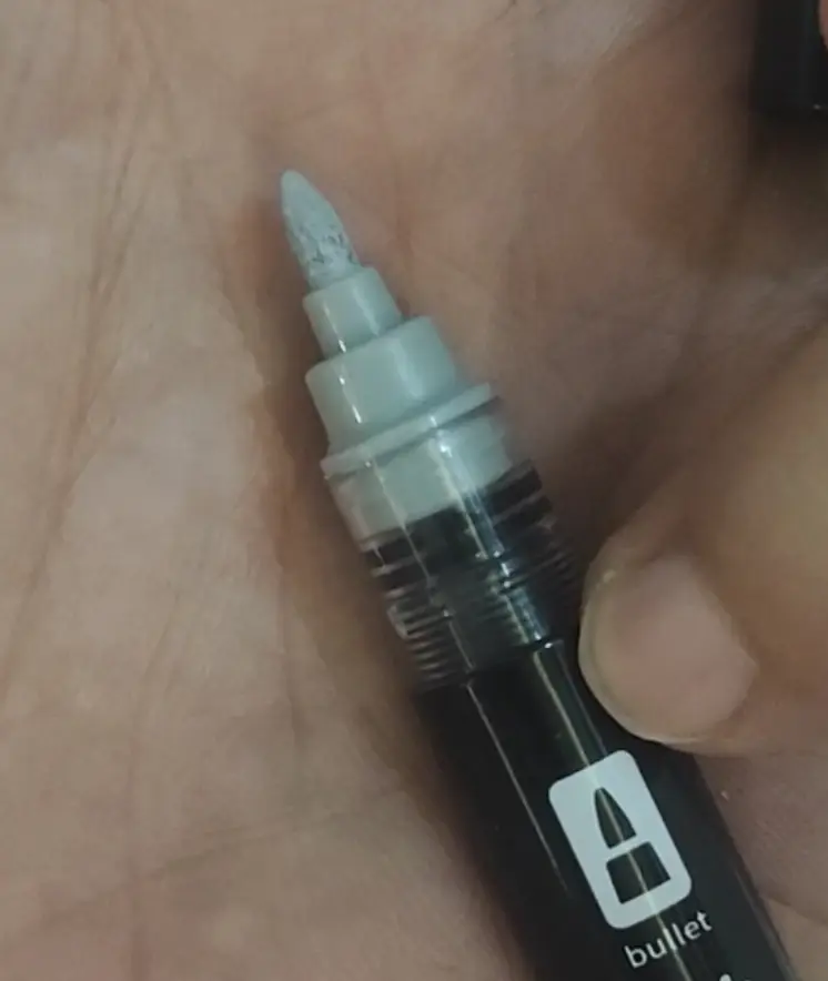
Dual Acrylic Marker: The Bullet nib brings a homogeneous flow along your sketching lines.
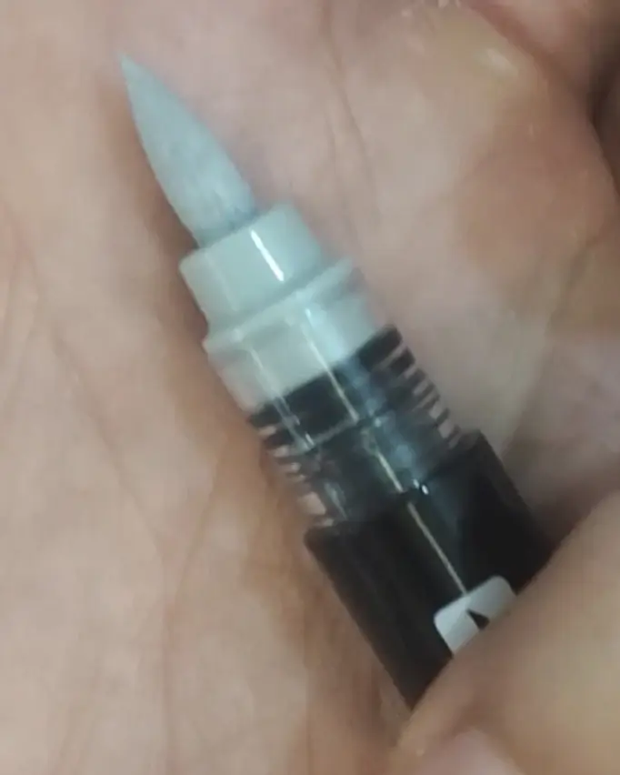
Dual Acrylic Marker: The Brush nib that is softer and allow to add special effects on your sketching lines.
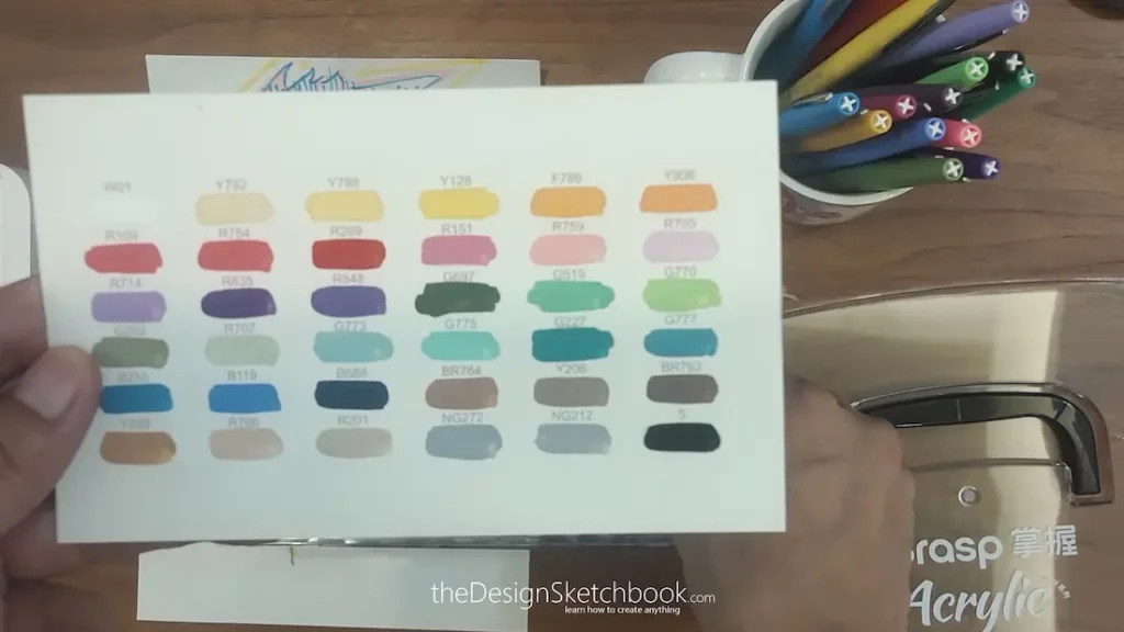
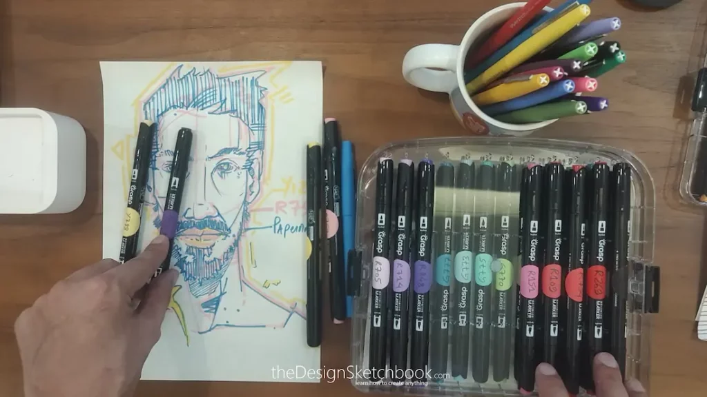
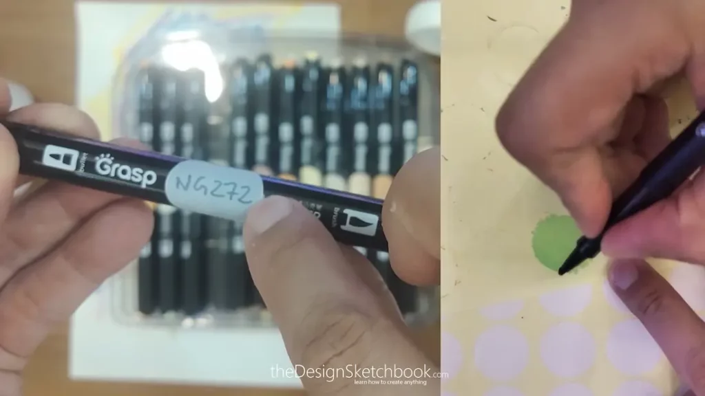
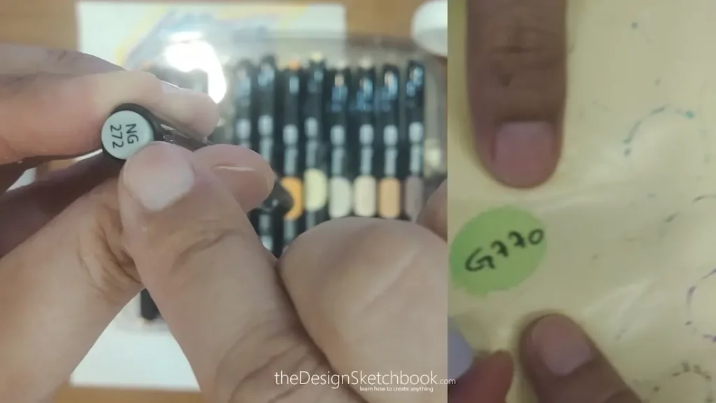
Here’s a little secret I use to keep organized:
- I put small stickers on my acrylic pens,
- Paint the color on it
- Write the pen’s exact color code on them.
This way, whenever I’m sketching from my color palette, I can easily access the right pen without guessing, which is a huge time saver!
2. How I Choose My Sketching Colors
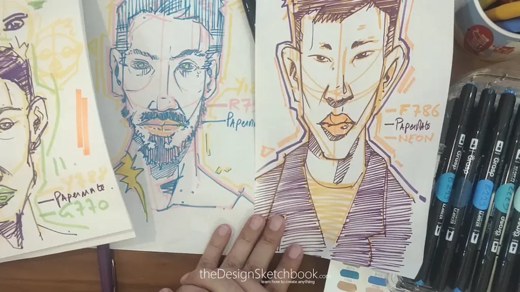
There are infinite colors combination to pick and mix from, and that can be overwhelming if you’re new. What I do is keep my color choices simple, usually sticking to three:
- A light color like pink or yellow for the underlay and construction lines are a great choice. This color is soft and subtle, helping guide the sketch without overpowering.
- A bold color such as purple or green for the main lines, the ones that really define the drawing with contrast.
- A highlight color for accents and brightness around the edges or on key details. It brings some “POP” to your sketch!
When you squint your eyes at my work, you mainly see the bold lines, but the lighter colors are there quietly guiding everything together. It’s like magic, mixing subtlety with boldness.
TIP: Take Inspiration from Basketball Teams’ Logos
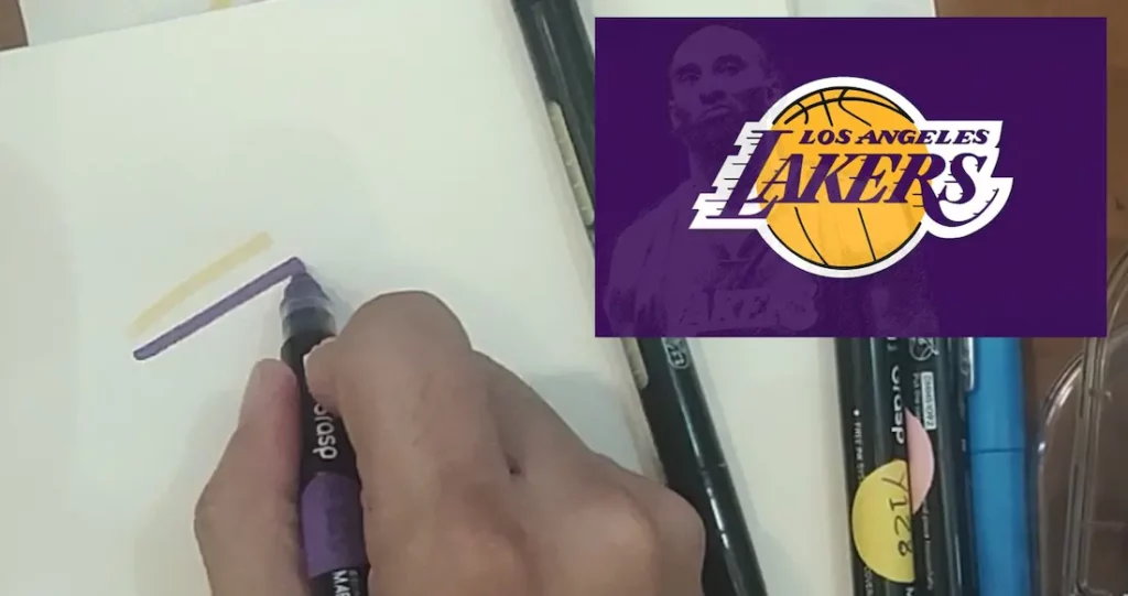
Basketball teams’ logos are bold, impactful and carry amazing color combo you can easily take inspiration from. Study them well extracting the color palettes, and you might realise they are used in plenty of other products you see and use in daily life.
3. Using Color in Action: A Quick Sketch Demo
- I usually start with the light color to draw the basic shapes, like the circle for the face and the symmetry axis. I add each element fast with a draft sketching style.
- Then, I switch to the bold color for the actual contour and shading, adding hatching for values and shadow under the nose and lips.
Sometimes I use the acrylic pen for quicker coverage on larger areas because they dry fast and cover well on top of the pens. It’s fun to experiment with those brush tips for different textures.
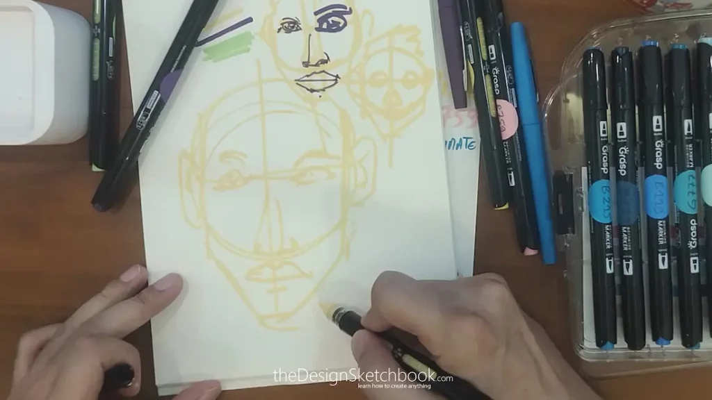
Build your main shapes and proportion with a light color without looking for perfection. That phase is done pretty fast when you reach a minimum of experience. If you are a beginner, don’t worry, take your time. Just remember that this first stage allows you to make mistakes.
You will then use it as “Guiding underlay” for the next stage of bold color drawing.
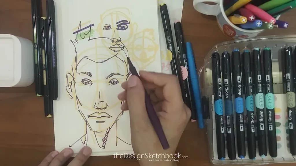
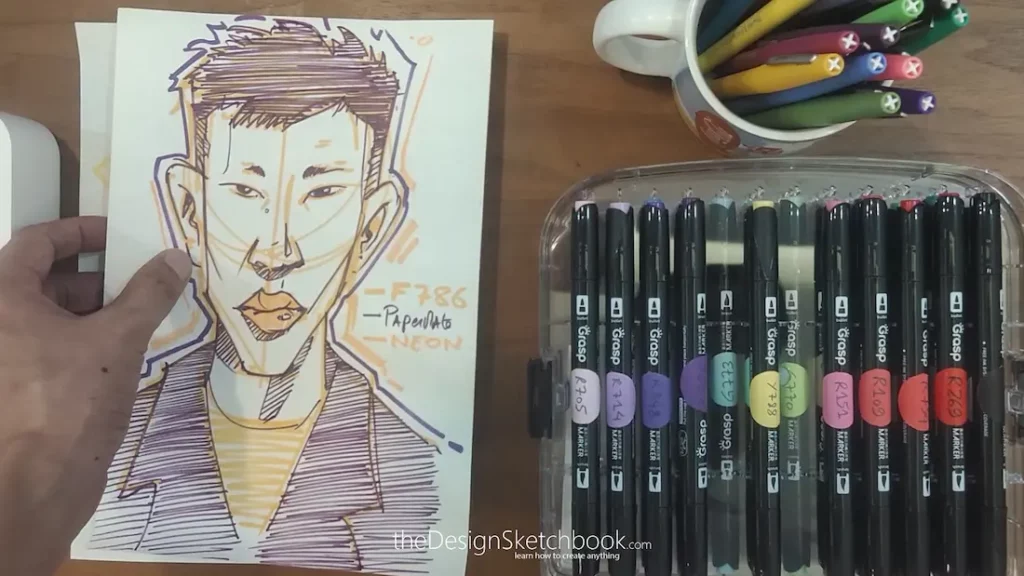
I took my Purple Paper Mate felt pen to draw on top of my pale yellow guideline. As you can notice, the pastel yellow becomes almost invisible by contrast.
This underlay allows me to draw with more confidence and avoid fundamental or proportion mistakes.
That being said, you will also increase your ability to draw better quality details.
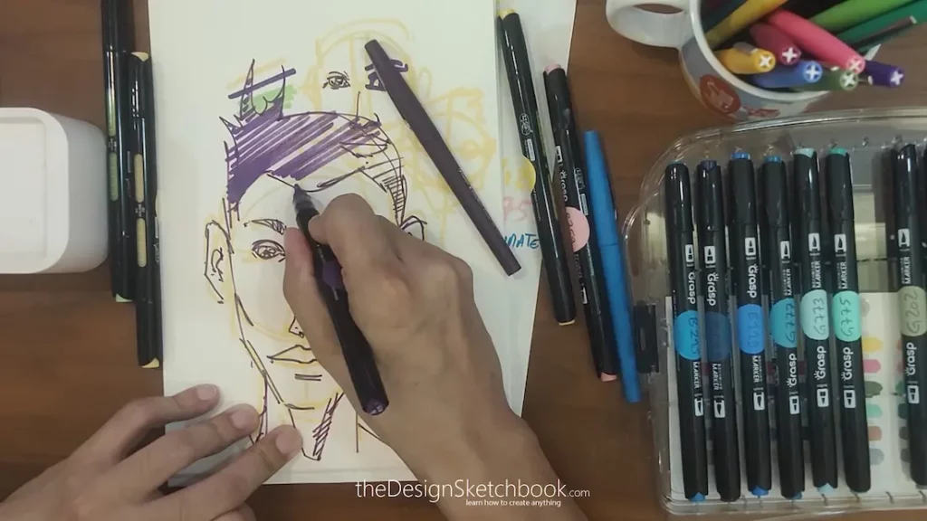
To save time, I fill the hair with my Acrylic marker having a thick nib.
Feel free to use the “Bullet” or “Brush” nib following your own appreciation.
Acrylic marker has a powerful power of coverage compared to Pantone or Copic marker.
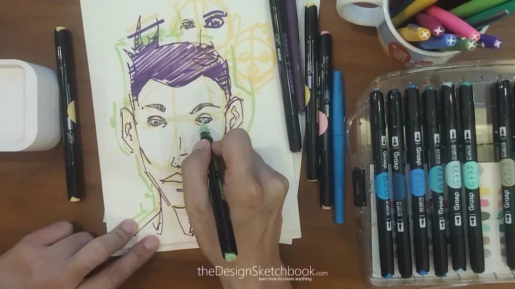
I level up the sketch vibrancy adding a pop acidulated green color on the edges giving a comic effect, somehow like Spiderman, the spider verse feel and add a hint of it in the eyes and the lips.
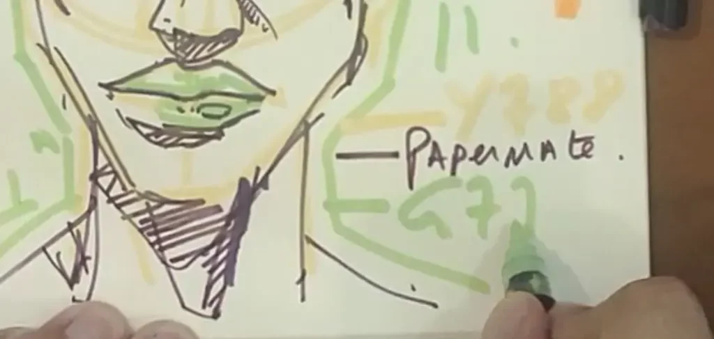
I write down the color pen references so I can reuse or improve it in my future drawings.
Hobby or Career, it is beneficial to gain in efficiency, and to be organised to improve your skills faster and better. Do not trust your brain to remember everything.
Outsource your ideas on paper. You will save plenty of time to reallocate it in the pleasure of creation.
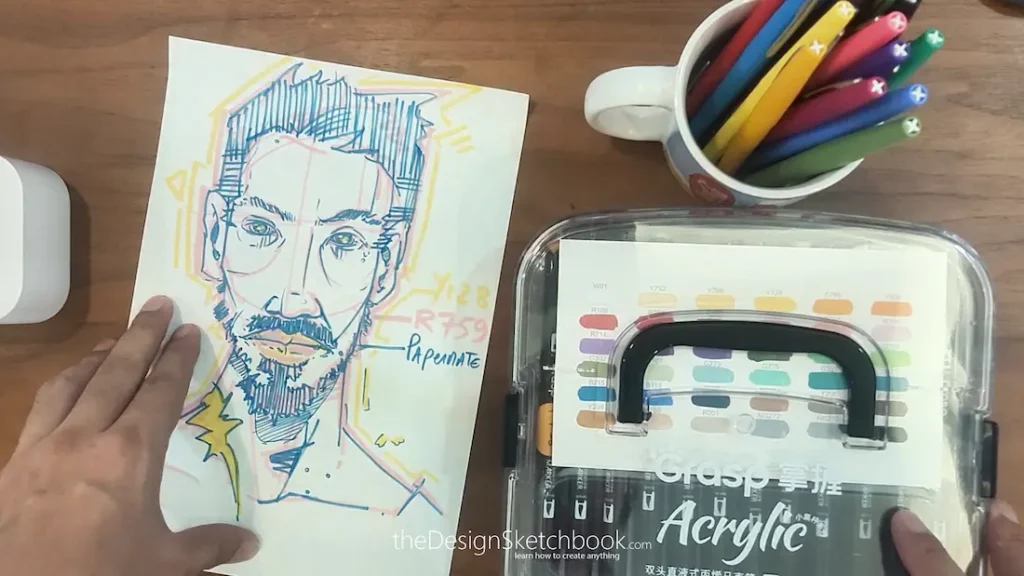
5. Take Notes, Make Your Palette Your Own
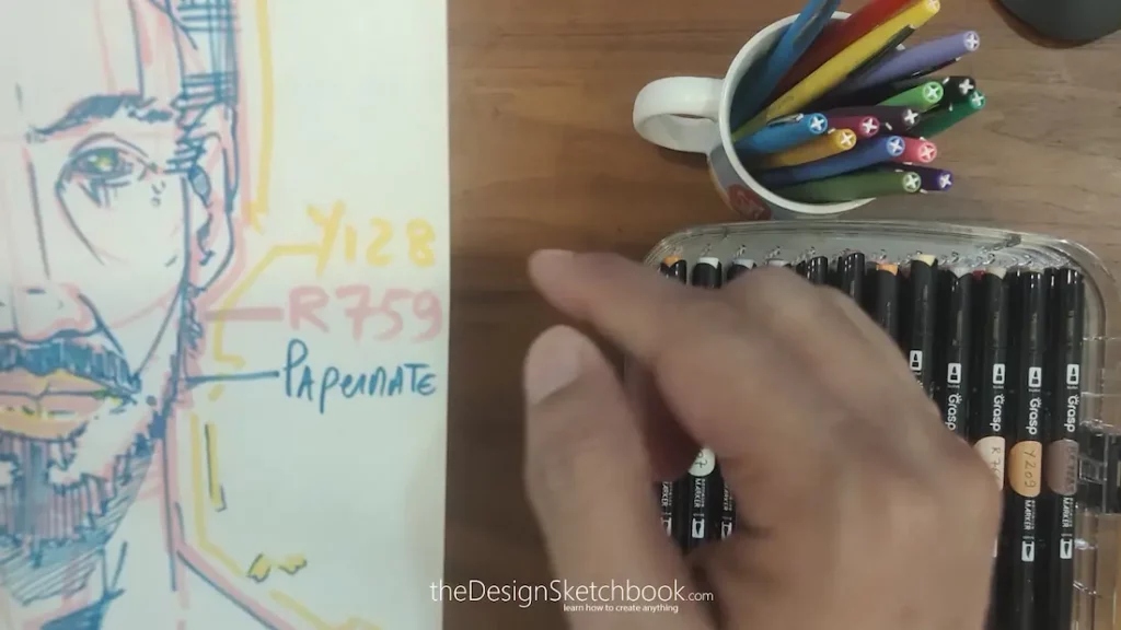
One practical tip I swear by: always note which pens you use.
For example, I jot down color codes like Y128 for my yellow pen or R759 for red on a little color panel. That way, when inspiration strikes again, I don’t waste time figuring out what colour combo worked previously.
You can create your own personal color recipe, gather them in a specific folder and build your collection of colour palette over time.
6. Don’t Be Afraid to Experiment Like in a “Mad Scientist’s Lab”!
Color sketching isn’t about following strict rules.
Maybe you want to add a wild fourth color or swap out the red highlight for an orange, go ahead! The important thing is to have fun and let your sketches come alive in your own unique way.
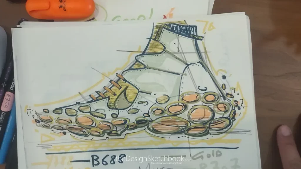
In the sneaker sketch above, I even used a gold marker!
I was not even sure the color I choose would come up good. But I had to try, and see how would be the outcome. Think of yourself as a Designer who experiment colors like a Mad scientist in his laboratory. 🙂
You can apply these tips to anything: portraits, products, fashion sketches, sneakers, architecture, you name it.
7. Final Thought: Keep It Simple, Keep It Playful
Remember, sketching is a journey, not a competition.
Use simple tools, create your system, experiment, and most of all, enjoy every mark you make. Whether your sketches turn out neat or a bit rough, it’s all part of the creative process.
Cheers,
Chou-Tac
Recommended Articles
Urban Sketching and Watercolor Tips: Inspiration from Malacca
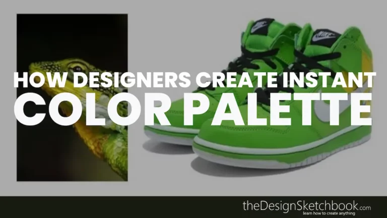
TIP 41 | Designers’ Secret: Spotting Color Combinations in Real Life

TIP 40 Finding the Right Color Combo with This Easy Testing Method
TIP 32 | Draw Greater Croquis with “Color Mechanical Pencil”
TIP 406 How to Draw Cylinders: Turn Your Paper to Draw Faster and More Accurately (Design Sketching for Beginners)


Add comment