1. Discovering Watercolours at 4 a.m.
Lately, I found myself awake at 4 a.m., scrolling through Instagram, when I stumbled upon Chanqueen’s vibrant watercolour sketches of Hong Kong.
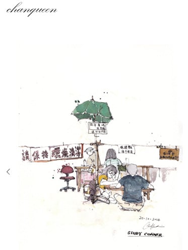
Chanqueen art immediately caught my eye, especially the way she mixes colours and cleverly leaves portions of the paper untouched.
Those blank surfaces aren’t just empty—they give her scenes room to breathe, adding both visual impact and emotional depth.
2. My Start with Watercolours and Digital Experiments
Inspired by Chanqueen, I’ve started dabbling with watercolours myself—mainly through Photoshop for now. Digital brushes make experimenting easy, but nothing quite replaces how real watercolour soaks into paper with its unexpected patterns.
If you’re trying this in Photoshop, I recommend exploring custom brushes to mimic those textures, and set up separate layer groups for each experimentation.
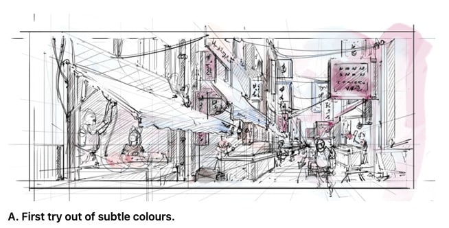
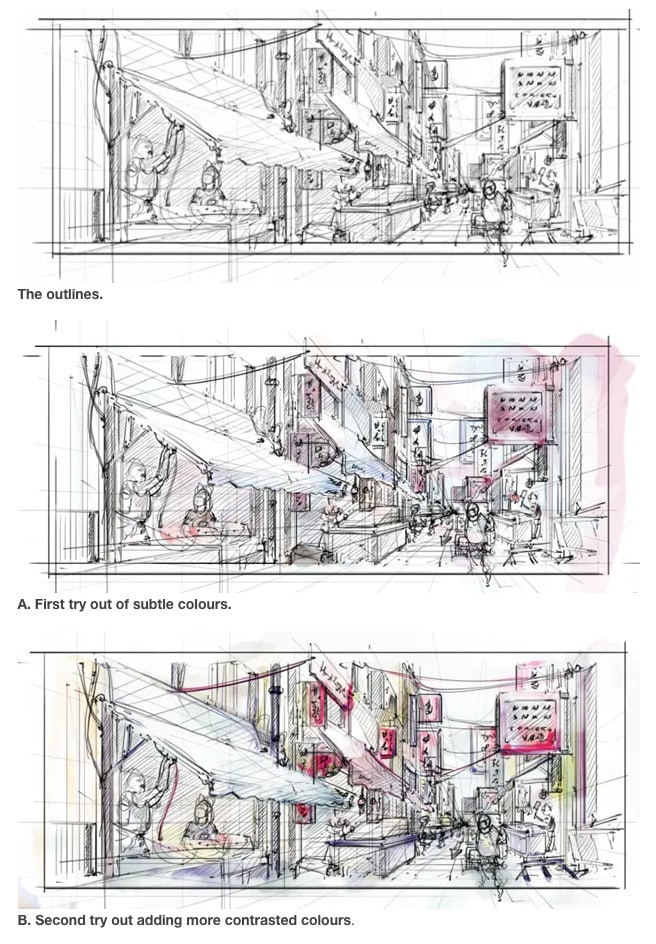
3. Two Styles: Calm vs. Busy
For my own tests, I tried two approaches:
- In Layer “A,” I focused on simple outlines and gentle colours, leaving more open space. The effect is calm and understated.
- In Layer “B,” I layered more contrasted colours, filling in more of the surface. It’s livelier and busier, with less breathing room.
4. The Power of Blank Surfaces
What I’ve learned is resisting the urge to fill every inch is key. Leaving blank areas creates a sense of openness and makes the sketch feel alive—just like how Chanqueen does it.
5. What Do You Prefer?
Which style do you prefer, “A” or “B”?
I’m leaning towards the calmness of “A,” but experimenting is half the fun.
Let me know your thoughts!
See you guys!
Cheers,
Chou-Tac
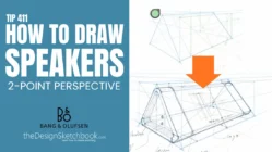
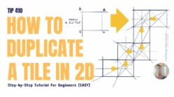
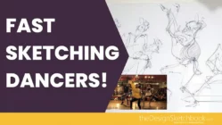
Related Articles


I guess A looks neater and calmer 🙂
Oh yeah, calmer. Even if there is the same amount of people, “B” looks more crowded, animated or busy.