It was about 4 a.m.,
I couldn’t sleep and I bumped into Chanqueen watercolour arts on Instagram.
I enjoyed looking at her sketches that brought some colourful lights into my head.
Her artworks show different scenes of Hong Kong.
I really like the way she mixes colours and subtly leaves blank areas.
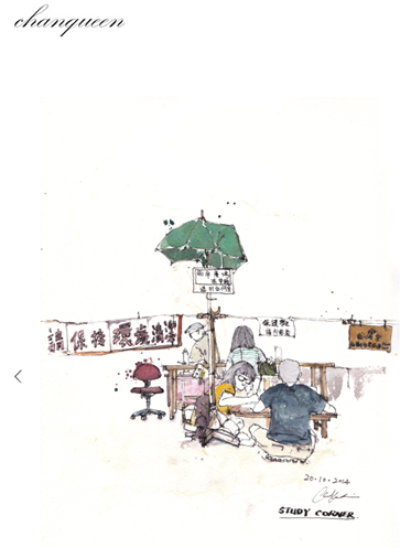
Chanqueen
I am getting some interest in watercolour, and never really took the time to explore it.
As I have been training in a drawing environment recently I guess it’s logical I get more exposure to it.
I’ve ordered some books from Amazon US.
The shipping takes a while to reach my place.
Anyway, I’ll tell you more about these when I’ll receive them.
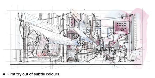
Below are some of my first tests of watercolours on Photoshop.
The effect is not as great as real watercolours.
As it doesn’t reproduce the same feel of irregular paper absorption of the colours.
Photoshop brushes are by default too clean.
For that, you need to download extra brushes online.
Take note that Photoshop allows you to make as many attempts as you need.
That’s convenient, especially when you explore multiple colour combinations.
I usually create 1 group of layers for each.
The outlines with a first attempt at colours
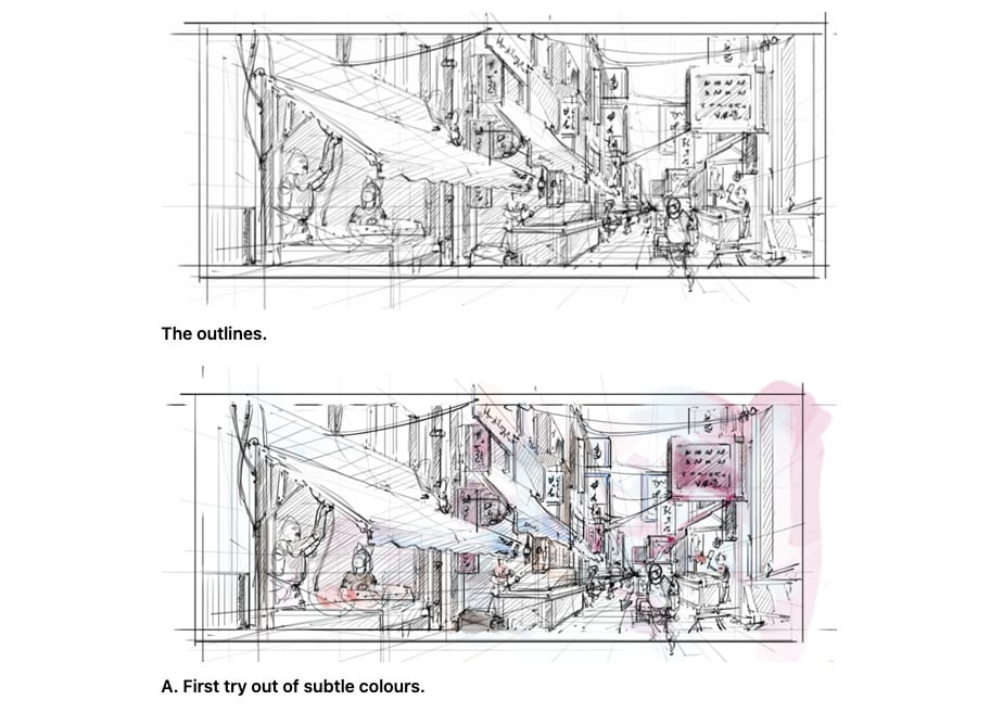
B. Second try out adding more contrasted colours.
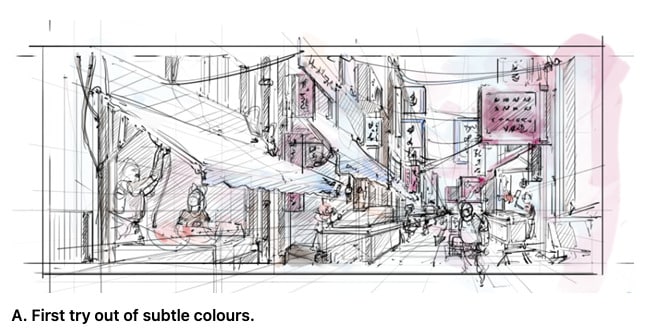
What is quite difficult is actually resisting the temptation to fill everything.
It’s quite important to purposely leave some blank surfaces in order to make the sketch breathing.
It’s not compulsory, but in my opinion, it gives a visual and emotional impact to your sketch.
Chanqueen masters it great. It’s inspiring to look at foreign artists.
I’ll try to level up myself.
It’s not easy but it’s fun to experiment!
Let me know which tryout you prefer A or B?
See you guys!
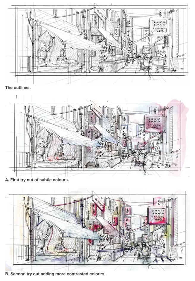


I guess A looks neater and calmer :)
Oh yeah, calmer. Even if there is the same amount of people, “B” looks more crowded, animated or busy.