Concept art, product design, car design, fashion design… all use this trick. It’s essential when you present your initial sketches to your colleagues, friends or eventually clients to promote your best ideas (Such preliminary research are seldom presented to the clients – except if a top selection is made.)
To direct people’s eyes on certain elements of the board you mainly play with:
- the composition
- the size contrast between the sketches
- the personal annotation
- and colours.
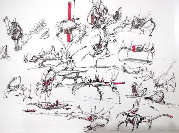
The sketches was made on paper, so the composition of the board is as per original. And I didn’t really bother much about it for this board. However, I played with a pop of colours. It’s fast, and efficient.
Keep to 1 pop up colour, and one cold grey for shadow. Warm grey is fine. It’s up to your personal preference. (I recommend the cold grey).
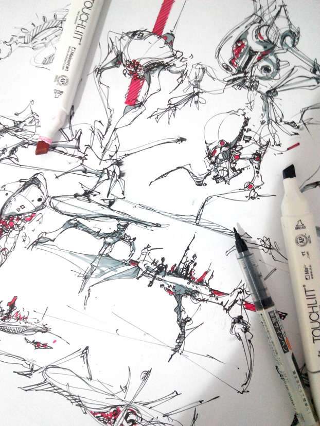
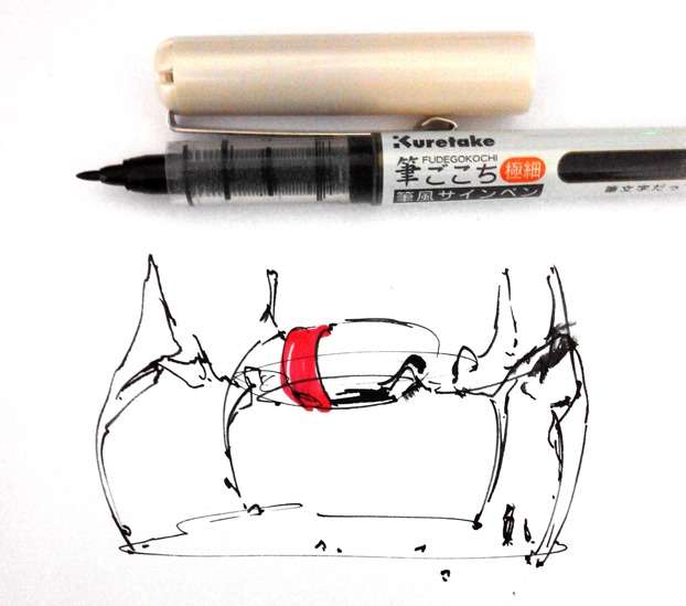
If you draw with a pen you are not familiar with, test it on a side paper. See how long does it take to dry. You might avoid making such stains (above picture).
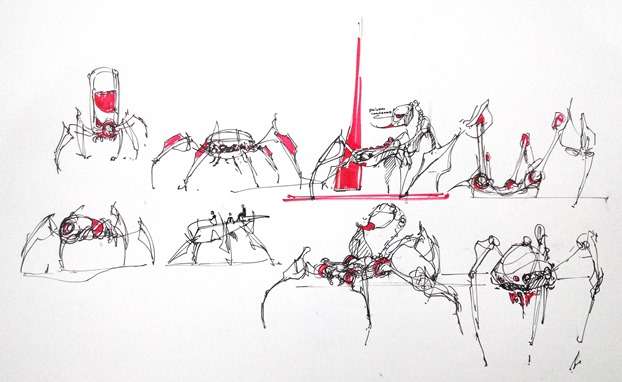
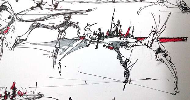
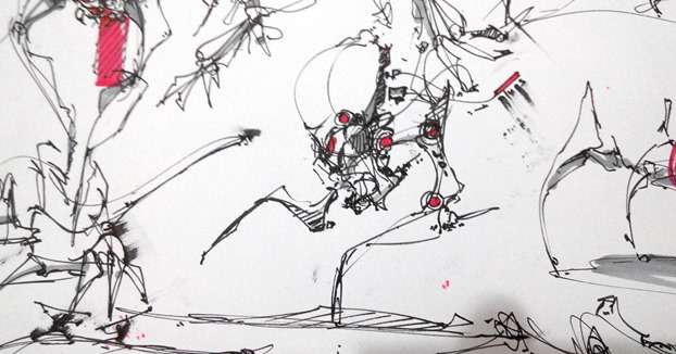
I add colour on small details or surface like the joints, lighting, eyes, props. Beside that, you can showcase a specific sketch adding a quick colour background behind it. Car designer use this trick a lot.
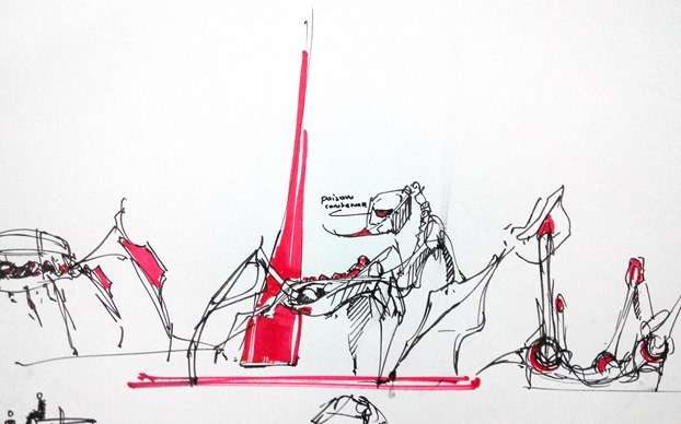
Don’t hesitate to write down some note. It can be about anything cool that pop up in your mind.
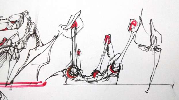
Adding the pop up colour in strategic places will help viewers to understand your sketch instantaneously.
Tools:
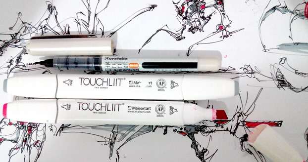
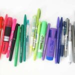
The markers I use are from a cheap brand I get in Vietnam. I saw them on Ebay for a reasonable price.
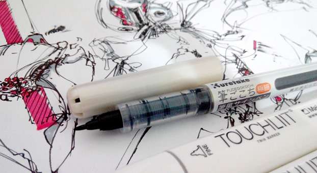
The pen has a soft tip that bend with pressure. It reacts like a small brush. This is how I could play so smoothly with the line weight. The brand is Kuretake, and you can find it Tokyu Hands shop.
Hope you guys enjoy, and remember that all these TIPS are applicable to any design field, especially product and car design.
Tell me your techniques in the comments !

Add comment