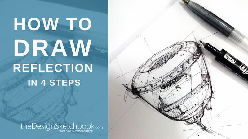
Theories that explain “light reflection on glass surface” are complex and can take a lot of time to fully explain. But it can also be explained in 4 steps only!
For now, we’ll approach things simply, using a light reflection method that takes advantage of shortcuts.
The first shortcut is to treat all similar transparent surfaces, such as plastic, like glass.
Even if these materials don’t have exactly the same reactions to light,
you can generally use this trick to simplify the process.
TIP
In most cases, a designer’s sketches are not meant to be ultra-realistic, but to be simply a viable representation that is both forceful and attractive.
Below are some concrete approaches ready to be put into practice for fast and effective results. With these, you will gain confidence and be able to begin to tackle more complex subjects.
TIP
No matter how complex the object is,
you should represent the reflection of light in the most simplistic way possible.
In drawing light on surfaces, there are multiple factors in play, such as reflection, refraction, light transmission, and opacity. Some surfaces are less reflective than others.
For our exercise, we’ll assume all reflective surfaces act like very reflective glass. For this sketch, we’ll simplify the image and discard all but the essentials.
How to make a Light Reflection drawing
 I’ve selected the four following factors to focus on:
 I’ve selected the four following factors to focus on:
- The thickness of the glass
- Surface shape (is it flat or curved?)
- The illuminated area
- The background elements
TIP
Minimize the number of factors to simplify and clarify the image.
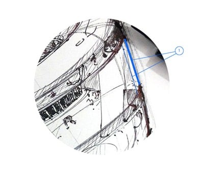
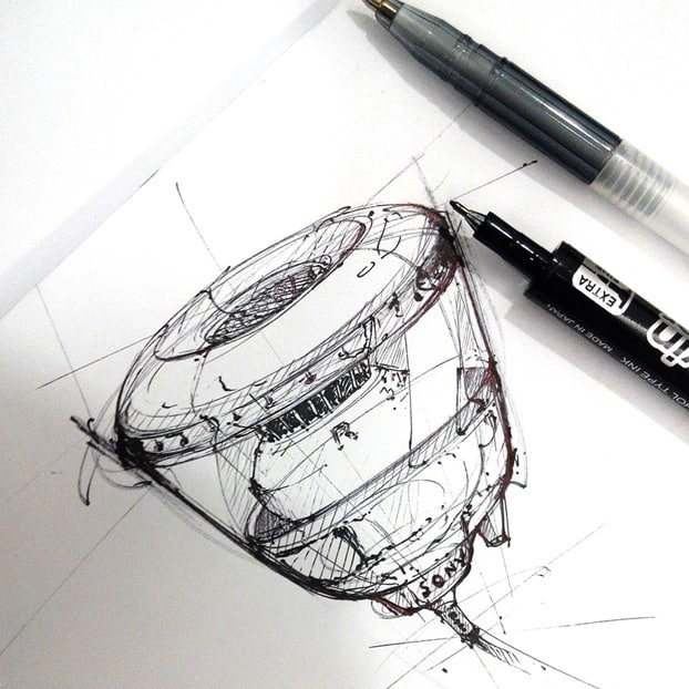
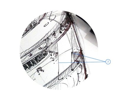
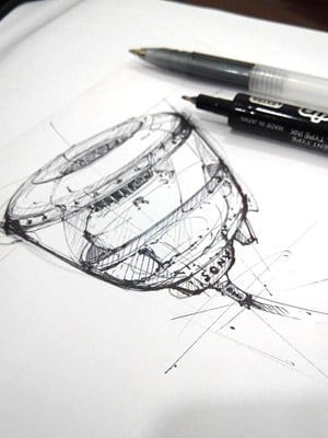
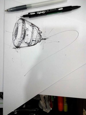
1. Thickness of glass
Draw the thickness of the glass lining the edges of the object. This inner line should be very slight.
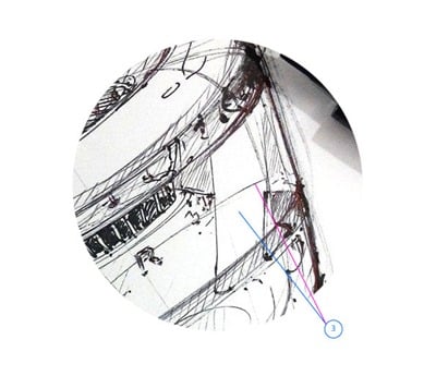
2. Surface shape
You can draw reflections with outlines that don’t exist on the object in reality.
These outlines make the edges of the lit area clear and will help you to draw around the illuminated area without breaching it.
Remember to keep your lines fluid if you’re drawing a curved object.
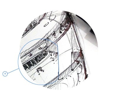
3. The illuminated surface
The area where light is reflected by the object will be completely white. This will create a contrast that gives the impression of reflected light.
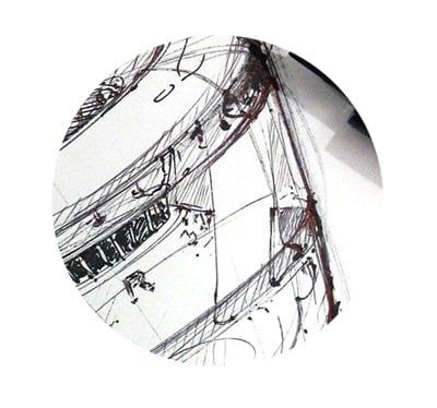
Spot of error: Note the presence of a curved line that cuts an area in half. That is, in fact, part of the original ellipse of the sketch. I made the mistake of beginning my sketch with overly heavy lines.
4. The background elements
This is the main secret:
While drawing, place your light reflections in a fashion that means they hide some of the visual elements placed behind them. Of course, make sure what you block out doesn’t take away from the comprehension of the drawing. If the image is symmetrical you can hide a fair amount, as the brain will automatically recreate the hidden part of the drawing.
I used three drawing utensils:
- a 0.5mm ballpoint pen
- a 0.7mm ballpoint pen (standard)
- a PILOT twin marker
Multiple drawing utensils aren’t necessary. These three are an easy combination for creating strong contrasts.
A few mistakes have crept into the sketch, but the final result still stands strong. Be demanding with yourself, but remember to keep moving and to deal with your mistakes.
You want to make a sketch, not a “technical blueprint”.
GOOD TO KNOW
A designer draws to produce ideas, not solely to create beautiful illustrations.
There is a sense of production in design work and efficacy.
If a designer aims to optimize their work and research time, the drawing too will benefit. The faster and better you draw, the more your final ideas will have the chance to become successful, and visa-versa.
This method is what I use personally in my work.
If you have your own strategies, feel free to explain them in the comments section below.
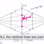
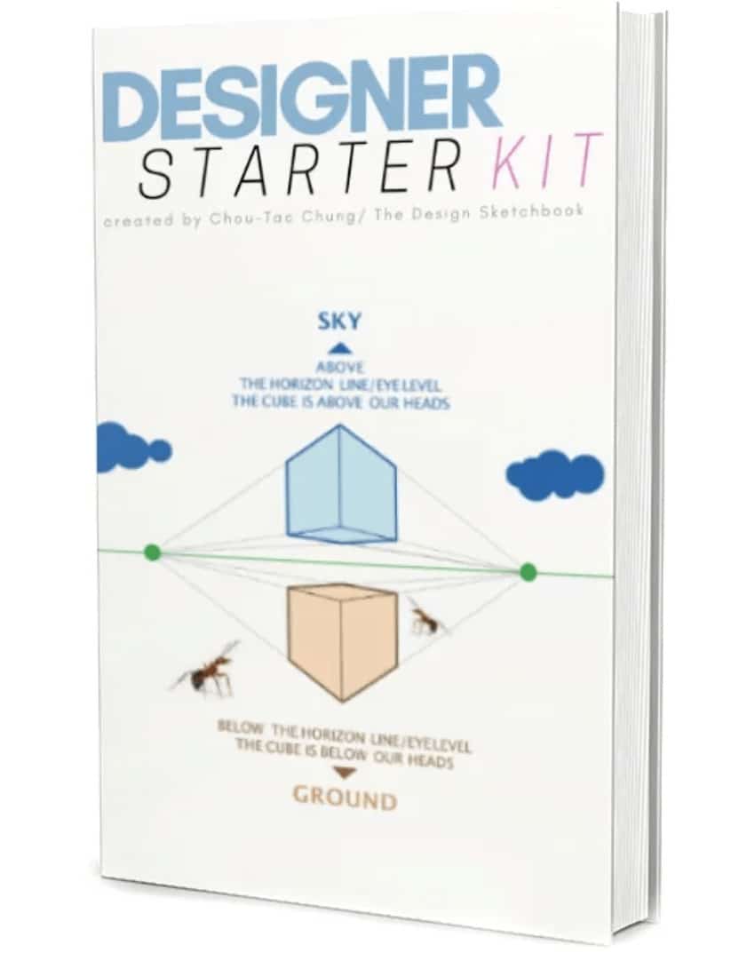
If you want to take your first steps in drawing, I invite you to download the Designer Starter Kit to start learning with the basics of perspective step-by-step.
The Designer Starter Kit exercises in 6 videos:
- How to draw straight lines
- How to draw a perfect square
- How to draw awesome circles
- How to sharpen your sense of proportion
- How to draw a cube with 1 point perspective
- How to draw a cube with 2 points perspective
Once again, these videos are linked to the Designer Starter Kit.
To enjoy the series of tutorials better,
I recommend you guys to receive the book first.


[…] a previous post, we saw how to draw a reflection on flat and transparent surfaces. Now, it’s about transparent volume. The degree of difficulty is a bit higher but still […]
Hi Gautam,
More articles and tutorials in Basic essentials and Design Articles are coming soon.
Feel free to let me know about your progress.
Thank you for your feedback.
Cheers,
Chou-Tac
Good day sir,
I am aspiring to become a designer. I just started exploring this site and I am already very appreciative of the kind of work you are doing here. I finished reading through the Basic Essentials and Design Articles (this being the last one) and I’ve already picked up on some useful information and pointers. This particular topic though, light and shadow representation in a sketch, is something I haven’t been able to grasp yet. I can draw objects but I have not been able to take them to the next level by adding the light and shadows to them to make them more descriptive. This article also remained a bit vague to me. But I hope that it would be discussed in a little more beginner level detail in the 365 K.S.drawing tutorials. I’m going to start with Sketch 1 today. I really look forward to learning many things from you, sir :)